“Typography is the voice of the written word.
On the one hand it can be very expressive:
It can shout or whisper,
have a regional accent,
be strong or fragile…
On the other hand it can be completely anonymous,
carrying the communication with such subtlety that if it draws the slightest attention to itself, it has failed miserably.”
{Quote from Type Matters by Jim Williams}
Back in 2011 when I took an Adobe InDesign class, I was introduced to the concept (if you can call it that) of Typography. At first I didn’t really care much about it, but soon I started liking it. Now I love lettering design and typography so I’ve been trying my hand at it a little. In the meantime I noticed so many other people are starting to join the lettering and typography movement, and I’m sitting here feeling a little jealous thinking “hey, I was into this first” kind of thing. 😀
These lettering designs are what I came up with a few months back when I was in an artsy, happy mood. I did it just for fun, using words that have a beautiful meaning- and just for my blogging friends too 🙂
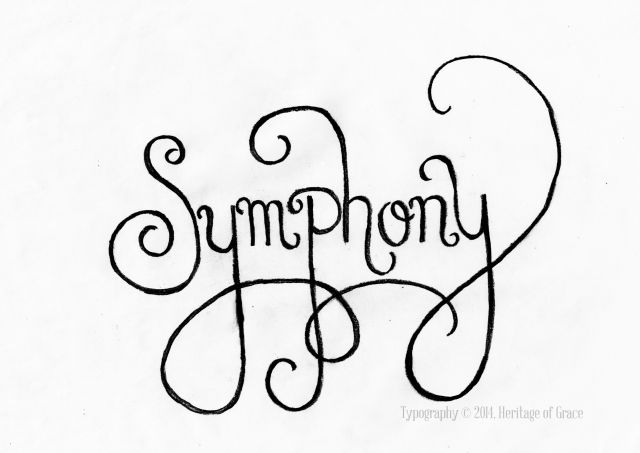
This first one is a more swirly, curly design. I wanted it to look musical, to really illustrate the meaning of symphony. I scanned and edited all the designs a bit in photoshop to accentuate the color, but I’ve kept the softer pencil look in the last two designs because I like both.
Then, after getting some constructive critiquing from family, I came up with the second version of the design. I suppose this one is just as stylish, but probably not as flamboyant with the curls. I like both- I can’t decide between either one.
Which do you like best? First or second?

My second design described my mood that day- joyful and happy inside. I was thankful for a blessed day; the Lord was good. So I wanted to express that joy through flow-y dynamic letters, yet still hold a peppy spark of “joyfulness” to it at the same time.
Semper Fidelis- (Latin: Always Faithful). I love the meaning of that. It’s the Marine Corps motto, but I think it holds true in our spiritual life as well. The Lord Jesus is always faithful, and it is something we should also have in our dedication to Him.

So, which ones do you like best? I can’t wait to hear what you think! Would you like to see more posts with typography?


Ooohh, those are so nice! =) I personally like the first Symphony. Great job! =)
I think you’ve done a great job of capturing the meaning behind the words, Becky. I prefer the second “Symphony” because it is smoother.
It does my little designer’s heart good to hear that it really illustrates the meaning behind the words! Thanks for your input; it’s fun to see everyone’s different style.
I like the first! Probably because I like curls. 😉 The third is also a close favorite.
Thank you Esther!
I like the first Symphony and Joyful. Well done Rebekah! They are nice!
Aw, thanks Bonnie! I’m glad you all like the first design with all it’s curly flamboyance.